The Magic of One Page Checkout: Definition, Features & Optimization
When it comes to online shopping, customers crave a quick and hassle-free checkout process.
While they understand the importance of providing necessary information to complete a purchase, they don’t want to be slowed down by a lengthy and complicated checkout process.
In response to this demand for efficiency, an increasing number of online businesses are making the switch to one-page checkouts.
These streamlined checkout processes are designed to enhance the overall shopping experience and, in turn, increase conversion rates.
Notably, Shopify has introduced its one-page checkout option to a range of its merchant tiers, including Basic, Shopify, Advanced, and Plus, as of September 25, 2023.
If you’re looking to implement a one-page checkout for your business, this blog provides all the vital information you need.
What is a one-page checkout?
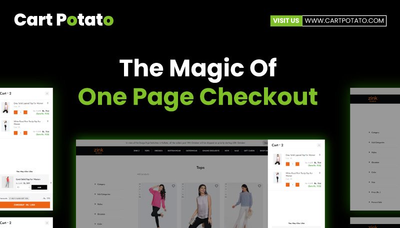
A one-page checkout is a streamlined e-commerce checkout process that consolidates all the components of a typical checkout onto a single page.
This includes details like the shopping cart contents, payment information, shipping and billing addresses, and shipping preferences.
This approach simplifies the user’s experience by allowing them to input all necessary information, review their order, and finalize their purchase on just one page.
This eliminates the need for navigating through multiple pages and significantly reduces the time and effort required to complete a purchase.
Shopify has embraced this concept by transitioning to a one-page checkout system.
This updated approach replaces the previous three-page process with a much more efficient and user-friendly experience.
It’s been designed with a focus on speed and boosting conversion rates, ultimately offering buyers one of the best online shopping experiences available.
Features of a One-Page checkout
The main characteristics of a one-page checkout are its focus on simplicity and speed.
This type of checkout process consolidates all the critical transaction elements into a single page, allowing shoppers to enter their information, review their order, and complete their purchase without the need to navigate through different pages.
This checkout:
- Displays Product Information: It showcases product choices, prices, and shipping alternatives. Customers can conveniently assess their purchase, including product specifics, total expenses, shipping times, delivery charges, and company policies, all within a single location.
- Provides All Necessary Fields: It includes all the essential customer details, such as contact information, shipping address, shipping preferences, and payment information, all in one go.
- Offers Customization and Extensibility: Shopify’s one-page checkout is entirely adaptable and designed for extension. It’s built on Checkout Extensibility, providing merchants with a high degree of flexibility. Also, this one-page checkout smoothly integrates with existing extensibility applications and is upgrade-friendly. Furthermore, merchants can easily preview and switch between the three-page and one-page formats using the checkout editor.
Benefits of One-Page Checkout
For Customers:
- Simplified Buyer Journey: One-page checkout significantly simplifies the purchasing process for customers. It reduces the number of steps and clicks required, streamlining the entire checkout. This eliminates wait times between page transitions and confusion about the next steps.
- Enhanced User Experience: One-page checkouts provide an improved user experience and boost customer satisfaction. They remove friction from the buyer’s journey, making it more convenient and efficient.
For Businesses:
- Higher Conversions: One-page checkouts, like Shopify Checkout, are strategically designed to increase conversion rates and minimize friction between buyers and merchants. They expedite the buying process, ensuring more completed purchases.
- Delightful Customer Experience: One-page checkouts empower merchants to offer a top-tier shopping experience that delights customers and encourages their return.
- Visual Customization: Businesses gain greater flexibility to customize the visual aspects of one-page checkouts to align with their brands. This includes the addition of custom fonts, favicons, and colors, as well as extending capabilities like delivery date pickers or personalized shipping options through third-party apps.
Strategies for Optimizing a One-Page Checkout
- Leverage Customizations:
– Utilize Shopify’s customization features to create tailored checkout experiences with ease. Custom-code and no-code applications enable adjustments to the checkout’s appearance without compromising its core functionality.
– Personalize the checkout page design, incorporating brand-specific elements such as colors, fonts, logos, and favicons to maintain consistency with your website’s overall brand experience.
- Add New Functionality Through Apps:
– Harness checkout apps and APIs to fine-tune your one-page checkout according to your unique requirements. This allows you to introduce specific checkout features that cater to your customers, products, and shipping needs.
– Examples include collecting additional buyer preference information to suggest products or subscriptions, integrating loyalty program options, providing pickup choices, and accommodating gift messages.
– Additionally, Extension apps, which offer supplementary capabilities, enable the incorporation of features like custom discounts, shipping rules based on customer location, and specialised payment methods, achieved through custom code adjustments.
- Reduce and Simplify Form Fields:
– Simplicity is key in one-page checkouts. Only request information that’s essential for completing the transaction and shipping the product.
– Minimize the number of form fields and, when necessary, make lower-priority information optional to maintain a fast and frictionless one-page checkout experience.
- Update Order Summary and Pricing Dynamically:
Concealed costs often deter customers and lead to cart abandonment. To prevent this, ensure that pricing is dynamically updated as users input information like promo codes, coupons, shipping addresses, and chosen shipping methods. This transparency eliminates unexpected costs at the point of purchase and enhances the overall checkout experience.
One-Page Checkout for B2B Enterprises
The Significance of One-Page Checkout for B2B Businesses:
Efficiency and simplicity are paramount in B2B transactions. Establishing strong, enduring relationships with B2B clients is a common practice, as these buyers are typically repeat purchasers.
Many times, they order the same items consistently, occasionally with minor adjustments.
Given this level of purchasing consistency, B2B clients prioritize suppliers who facilitate seamless ordering processes.
In this context, the checkout experience plays a pivotal role.
Shopify’s Commitment to B2B Optimization:
Recognizing the unique needs of B2B businesses, Shopify has introduced features aimed at enhancing their ordering efficiency:
- Easy Reordering and Quick Order Lists: These features streamline the reordering process, ensuring that B2B buyers can swiftly replenish their stock of recurring items.
- Upcoming Quick Order Form (Q1 2024): This upcoming feature will further expedite the ordering process by providing an efficient form for quick orders.
- Vaulted Credit Cards and Payment Terms: Shopify now offers vaulted credit cards and payment terms tailored for B2B buyers. This advancement allows B2B clients to complete their purchases without the need to repeatedly enter payment information at checkout. While vaulted credit cards are available exclusively for merchants using Shopify Payments, they are fully compatible with one-page checkouts.
Conclusion
Shopify enables merchants to showcase essential wholesale information that B2B buyers require. At the same time, it provides a faster and more convenient path to complete purchases. This commitment to streamlining B2B transactions ensures that the checkout process aligns with the unique demands of B2B buyers, ultimately building lasting relationships with valued clients.
FAQs
- Can I personalize the fields on my one-page checkout?
– Certainly, you have the flexibility to customize the form fields on your one-page checkout to display the information you deem necessary. You can also designate fields as optional or required and define specific formats.
- What are the potential disadvantages of implementing a one-page checkout?
– While one-page checkouts offer various benefits, it’s important to be aware that they can result in a different shopping experience for your customers. Furthermore, this change might affect your current conversion rate and checkout metrics in unexpected ways.
- How do I assess the effectiveness of my one-page checkout?
– To measure its, consider installing tracking pixels that allow you to monitor key performance indicators. These may include metrics like the conversion rate and cart abandonment rate over time.
- Can I switch back to a multi-page checkout if I find a one-page checkout doesn’t work for my business?
– Yes, Shopify provides the option to switch between checkout layouts. If you decide that a one-page checkout isn’t the right fit for your business, you can easily revert to a multi-page checkout.
- Are there any industry-specific considerations for implementing a one-page checkout?
– Implementing a one-page checkout can benefit various industries. However, it’s essential to consider your specific industry requirements. For instance, B2B businesses may need to cater to the needs of repeat purchasers with a focus on quick reordering and efficiency.
- What kind of support does Shopify offer for merchants transitioning to one-page checkouts?
– Shopify provides comprehensive support and resources for businesses making the transition to one-page checkouts. This includes guidance on customization, feature additions, and potential challenges to anticipate during the process.
- How can I ensure a smooth transition to one-page checkouts without disrupting my existing e-commerce operations?
– To ensure a seamless transition, it’s recommended to plan and test the implementation thoroughly before making it live. Also, consider providing information and guidance to your existing customers on the changes to their shopping experience.
- Can a one-page checkout accommodate multiple payment methods?
– Yes, one-page checkouts are designed to accommodate various payment methods to provide customers with flexibility and convenience.
- Are there any recommended best practices for optimizing a one-page checkout for B2B transactions?
– For B2B businesses, best practices include streamlining reordering processes, offering quick order forms, and integrating features like vaulted credit cards and payment terms to enhance the efficiency of the checkout process.
- How can I maintain a balance between customer experience and business efficiency when implementing a one-page checkout?
– Striking the right balance involves understanding your customers’ preferences and tailoring your checkout to meet their expectations while also aligning with your business’s efficiency goals. However, it’s a delicate balance that can be achieved through customisation and user-focused design.


